Blue Ridge Media
I led the creation and design of a website for a student project called Blue Ridge Media. I also directed the planning and development of the website’s content, including print, out-of-home advertisements, radio, and podcast scripts."

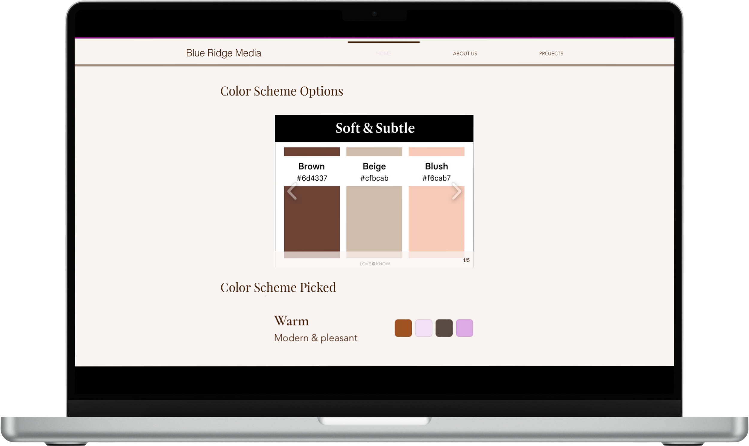
Color Decision and Design Rationale
Blue Ridge Media features warm colors such as shades of brown, tan, and burnt orange. These colors evoke feelings associated with warmth, like positivity, energy, and creativity. Displaying a warm tone throughout the portfolio evokes a sense of tranquility. Combining bold and muted tones, the modern color palette ensures a contemporary and stylish look.
The choice of Avenir font for the body text is not just about aesthetics. It's a strategic decision that reflects the clean and simple theme throughout the portfolio, ensuring optimal readability for the user. The use of Playfair Display font for headings adds a touch of sophistication and elegance to the hierarchy, striking a balance between modern and traditional elegance. This design choice enhances the user experience by making the content easy to navigate and understand.